Menu
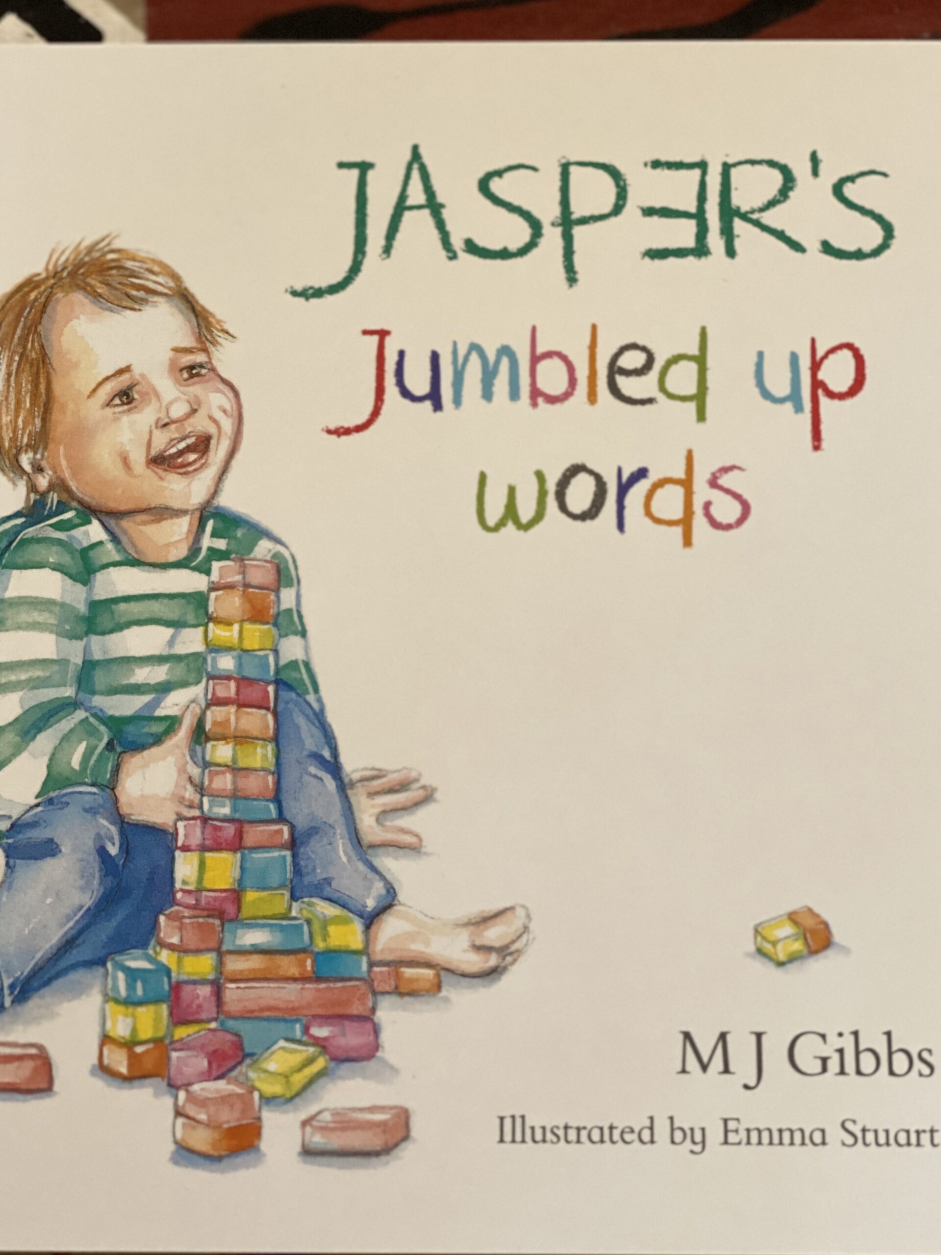
Book covers are important in drawing a reader in, like a hook enticing one to look further. Many times I have browsed in book stores and held a book in my hands to gaze into the colours, design and typography of the cover. Some covers are bold, vibrant and captivating, while others are quiet, softer in appearance with gentle images. My latest picture book Jasper’s Jumbled up Words shows a small toddler sitting on the floor smiling with his blocks. His name has the letter “E” back to front on purpose with the other letters in mixed colours that might appeal to children.
I didn’t set out to have this cover illustrated by Emma Stuart. It evolved. It was a decision between two illustrations and I thought this one summed the story up nicely. Always at the back of my mind during writing the story was the meaning and style of the cover. I hope it works well with its positive vibe and matching of the green “Jasper” word and T shirt.
Information is available at a quick glance, a glimpse into the story and character, a sales tool, an interest generator and ultimately it helps the book to feel a certain way.

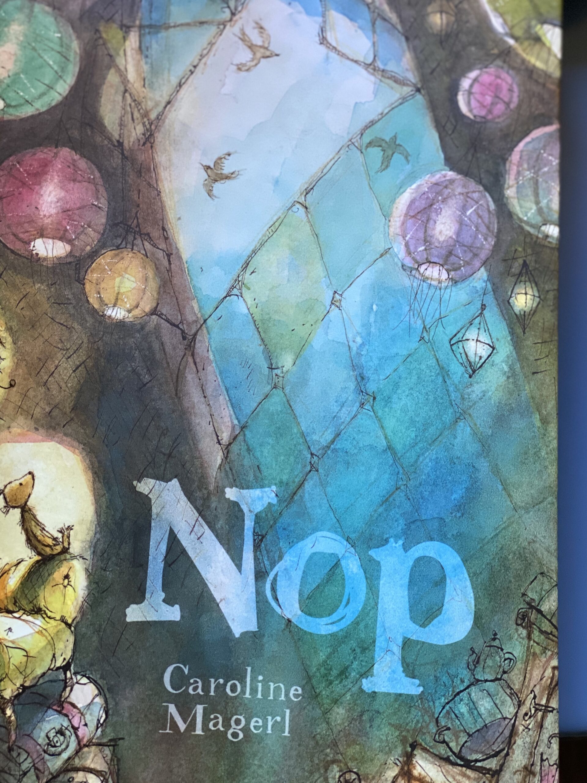
Caroline Magerl’s Nop captures a light filled, blossoming wonder of pretty colours that float on the page. The small bear on the side is gazing upwards in a painterly background. A beautiful cover with the author’s name and title cleverly worked.

Rainbow Bear by Stephen Michael King explodes with a dancing bear and colours to excite the senses. Different colours are used to fill in the lettering and by contrast, Davina Bell’s Picture story, The Underwater fancy dress Parade uses black lettering to stand out against a pale, pastel grey with hints of pale orange. Do you have a preference?
Wilam, an indigenous picture book shows the use of foliage and fauna painted in acrylics by Lisa Kennedy. Aunty Joy Murphy and Andrew Kelly have masterly crafted a great story about understanding Aboriginal culture. A closer look inside reveals deeper greens, blues and browns, patterns and repetition in the endpapers. And a modern twist on Alice in Wonderland sees this cover as quite unique with shining metallic lettering with the red letters for the title. You most certainly want to feel this cover.
Book covers like Together use cut outs for dramatic effect. Moonwalker uses animation or a cartoon style to create humour.

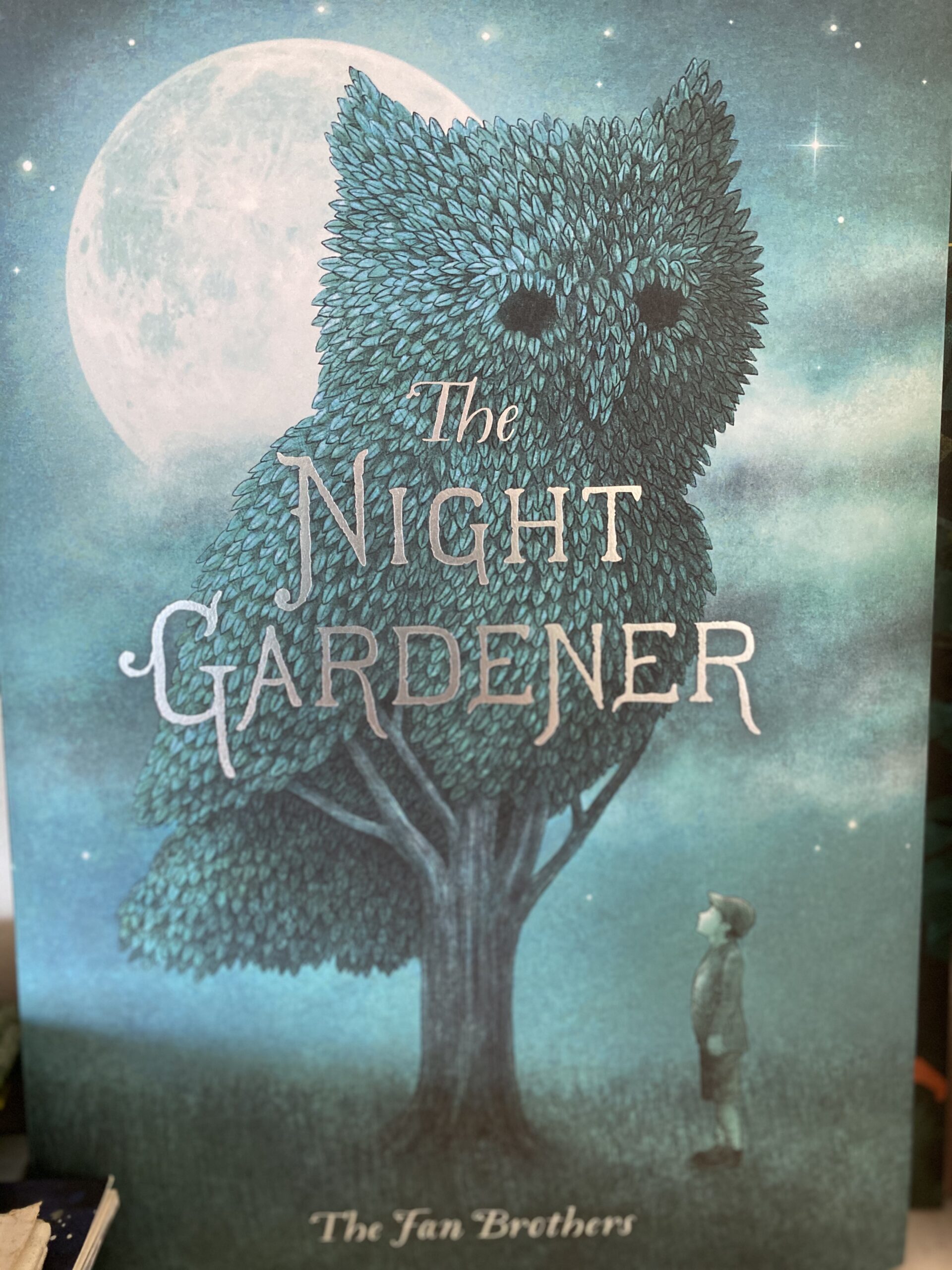
And the final cover check with Night Gardener is one that shows mystery, imagination and perhaps a surreal quality. The moody blues and lantern golden moon draw the reader in appreciate the owl tree. Love it!
Ask yourself these questions – why do covers work? How do they work? What materials are used to create a winning book covers? Which ones do I like the most and Why?
Enjoy the fine Winter sunshine and when you are next out in the library or book store, let your eyes roam the walls to discover a fun cover, a serious one and a contemporary historical cover. Bye for now.